Editorial


In the past months, I’ve researched a lot of female references. I think that they inspire me a lot for my current interests and I can’t help noticing that influenced a lot the Ebac projects but maybe Editorial was one of the most evident because of the articles. I chose mostly news about female empowerment, from music to sports and I appeal for female artists for inspiration.


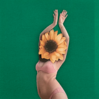
Giulia Rosa is currently one of my favorite artists because she is able to make illustrations with a lot of social critics without losing the delicate and refined aesthetic. Also, I like she makes digital art but in a way that some textures appear manual and the combination is perfect in my opinion.


Mia Ohki is another artist that I like a lot for she can transmit a lot of with few lines and in a minimalist way. She mostly talks about women’s connection with nature and female nature itself.


For my articles spot, I tried to bring simple solutions that at the same time communicated well the content. Two articles of mine talked about women in the surf, one was about women that surfed big waves, therefore the big blue heart idea and women’s equality when it comes to receiving the same salary in a sport still consider mastered by men only. My tests are mainly digital but trying different approaches nevertheless. I was able to discover different tools for making textures and outlines and even mix photography to make a kind of digital collage but in the end, the hand draw was the most aesthetically appealing.


The first spot trials were not successful, I tried arranging different sizes and changing the perspective using the same bugs from the opening illustration, but it was not so interesting because it did not add any information, it was only a piece of a drawing already made. But after receiving feedback from the class I made more bugs with different shapes and details and it worked better. Using one single bug different for the others looked much more appealing and I think that is also because the spot is so small that if you focus on only one big bug is way more clear to look at than many of them spread.

I was not completely satisfied with the white background, somehow it felt that something was missing but every time that I tried painting with color the bugs lost their highlight or simply did not fit. But then Daniel had the idea of using scanned paper textures that he sent to me and the one that worked the most was the more yellow one that gave another look to the illustration without taking away the contrast of the bugs.


I made some trials for the spot using only one bug; changing colors and shapes and they were interesting but to make it more interesting Daniel suggested making the details inside the bug in a way that suggested more and that’s when I had the idea of making Hitler’s face referring even more to the article’s content about anti-Semitic imagery.