Covers

The technique of Ashura was something that I already practice a lot in my daily drawing. I love to draw with nankin pens and I thought about using this technique for the book cover. I got interested in the idea of making a scene of the book The Metamorphosis in this style, so at the class when Daniel showed Edward Ardizzone I got immediately related to his work. It is kind of an old-style but I think that it can give also a “creepy” atmosphere to an illustration and the subject of the book Metamorphosis fit in this category in my opinion.

I loved Charles Shearer work for his color pallet and the composition of printing, I was thinking about playing with shadows (for example the shadow of the cockroach appearing in a room), when I saw his work. Like many Daniel show us in class I was not familiar with but enjoyed. I have a thing also for water-green colors as the first example but I knew that did not fit in the atmosphere I wanted for the book cover.

I’m very keen on children’s illustration books and I found these examples incredible for every element in it: the animal and nature drawing, the bright colors, and the beautiful typography. I don’t normally analyze a lot of typography but this one got my attention because it looks like an illustration as well, as the L and S make a form of a tail. None of these elements I thought fit with Metamorphosis but I couldn’t leave it out of my references for admiring it so.


Alibi from Agatha Christie was certainly my main inspiration for the book cover. It had all elements I wanted: the Ashura with shadows and also colors that could fit well in Metamorphosis style. Also, the theme of Agatha Christie books is mysterious and not jolly and bright color elements. It was unfortunate that I couldn’t find the name of the illustrator.


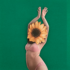
When I first received the book I was going to illustrate I automatically remembered an Album cover from a singer called Aurora. She was rapped in fabric and looking like a moth and I thought it would be a nice aesthetic for a book where there is the idea of an insect. Also, it has an almost dark appearance to it, with all the colors varying from white to brown.

Another example of collage that has insects and a “creepy look” that could relate to Metamorphosis


When analyzing the cover of Di Cavalcanti I was looking for Brazilian singers references since Tom Zé

When I saw the Beatles cover I automatically thought about making a portrait of Tom Ze in Nankin pen that I love to do, but add information so it wouldn’t be only a plane portrait that many covers already have


When I saw the Beatles cover I automatically thought about making a portrait of Tom Ze in Nankin pen that I love to do, but add information so it wouldn’t be only a plane portrait that many covers already have

Chippendale cover also made me think about a messy background mixing digital with manual for the LP and is similar to Coldplay’s aesthetics below

The CD cover from Coldplay was my main inspiration for my LP cover. It was what gave me the idea of using no padding typography


I liked the idea of using drawing within the pictures, it shows a space for imagination, as it was happening inside the singer’s mind


Again I got inspired by Andre Ducci illustrations, but in the case of the LP the aesthetics could fit well to a Brazilian atmosphere, which was not the case of the book cover. But I needed to keep in mind that Tom Zé album Defeito de Fabricação although required a more messy aesthetic. Ducci work although has a lot of details and information together they are all


The first font choices were a disaster because they were digital and didn’t fit with the manual work and the painting. It was when I used the handmade typography that I tested in my sketchbook that the title started to work and look more harmonic with the illustration


the painting in the background that I chose was old screenprint experimentation that I thought the colors fit well with the book atmosphere; not too dark or too light and almost brownish that for me remind me of dirt and bugs, and nasty things

This is the original drawing that I digitalized for the background tests. It was originally made in tracing paper so it was a bit of a challenge to clean it on Photoshop


The first tests did not involve the handmade painting that I used on the following and which I thought gave a much more interesting and complex aspect to add to the drawing of Tom Zé. I was worried at the beginning that a drawing of the singer alone wouldn’t be interesting at all, but I stuck with it because I liked how I capture his face and thought that with the right elements added I would make it interesting


The typography was certainty a challenge because I chose to make it big and with that choice, much of the illustration got covered, so I came up with the solution in the end with a leaked letter with only the tracings and add in the end a bit of the handmade painting. I thought it gave a nice final touch.